What are the greenest regions in GCP?
What is PUE, and how is it calculated? Why is important? What are the greenest regions in the GCP and where you can find that information? This, and many more, you can find out in this article.
The story of the greenest regions on the most used public Cloud Providers continues. Today, I'm writing about the state of the GCP, or Google Cloud Platform. How Google does it?
First, we'll answer some of the questions related to the numbers that we're going to see later in the article.
The thing that we'll cover first is the Power Usage Effectiveness, or PUE for short. What does it mean? How is it measured? After that, we'll go on to analyse the data available from the GCP. What do they publish, and what are the greenest regions available there? How long did it take me to find this information?
What is Power Usage Effectiveness?
Power usage effectiveness or PUE is a standard efficiency metric for power consumption in data centres. A simple definition of PUE is the ratio of total facility energy to IT equipment energy used in a data centre.
PUE = Total facility energy usage / IT equipment energy usage
Total facility energy includes the power dedicated to the data centre, measured at the meter. All loads, including IT equipment, cooling systems, lighting systems, and power delivery components.
Total IT equipment includes all energy fed to compute, storage, and networking equipment. As well as, other control equipment like KVM switches, workstations, monitors, and laptops.
Calculating PUE is not as straightforward as the formula seems. Despite the simple ratio and the acceptance as a standard performance metric.
PUE is not a one-time metric. It changes from time to time. It depends on the time of the day, load on the servers, where energy is coming from, location, and so on.
PUE values closer to 1 are better. That means that the data centre is using most of its energy (if not all) for the IT equipment operation. I'm wondering if the PUE can actually be 1? Maybe not, but one can hope...
To find out more about Power usage effectiveness in general, follow the link below. The blog post explains the basics of PUE and what we need to understand about the numbers.
On the graph below, you can see average PUE in Google Data Centres from 2008 until nowadays. We can see that the trend is decreasing. This means that the efficiency of the Google Data Centres is getting better and better.
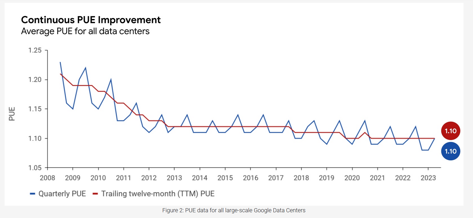
To find more information on the topic of PUE in Google Data Centres, follow the link below. There you can find how PUE values are calculated and PUE throughout the year. Reports for each quarter for each data centre across the globe are also available. Pretty cool!

Is PUE relevant to the greenness of a region?
Not exactly. PUE shows how efficient are data centres in their energy consumption. It doesn't show from which sources that energy is taken. Still, it's better for data centres to be the most efficient as possible.
Regardless of the energy sources, the efficient usage of energy is vital. We should strive to use the least amount of energy. That's why I wanted to give a brief intro about PUE.
What are the greenest regions in GCP?
Google, being all Google - information at your fingertips, made the search for this info quite easy. There is info all over the places about the regions being Low CO2. Well, not all over the places, only two. But never mind that.
What it means for a region to be Low CO2? In Google's terms, they are taking three metrics into account:
- Google CFE% - an interesting metric about which I'll write below.
- Grid carbon intensity in gCO2eq/kWh - I've covered this in How much carbon does my server emit? article.
- Google Cloud GHG emissions - in short - Scope 2 market-based emissions. Not perfect, but at least it's something. We also covered this in the greenest regions in Azure article.
Google CFE%
This is the percentage of the carbon free energy consumed in a particular region, on an hourly basis. Plus the investments Google has made in carbon-free energy in that region. Besides renewable energy coming from the grid, Google also includes carbon-free energy it produces in that region.
In other words - the average percentage of time application will run on carbon-free energy. More in this case is better.
To find out more about the Google CFE% and carbon-free energy, follow the link below. This article explains how they Google CFE% is calculated. Besides, it also provides some considerations in choosing the right Google cloud region.

Finally, the greenest regions in GCP are:
- Europe:
- europe-north1 in Finland,
- europe-west1 in Belgium,
- europe-west2 in London,
- europe-west3 in Frankfurt,
- europe-west6 in Zurich
- europe-west9 in Paris
- North America:
- northamerica-northeast1 in Montréal
- northamerica-northeast2 in Toronto
- us-central1 in Iowa
- us-west1 in Oregon
- South America:
- southamerica-east1 in São Paulo
- southamerica-west1 in Santiago
The table below shows a preview of which services are available in which region. The greenest regions have Low CO2 mark below its name.
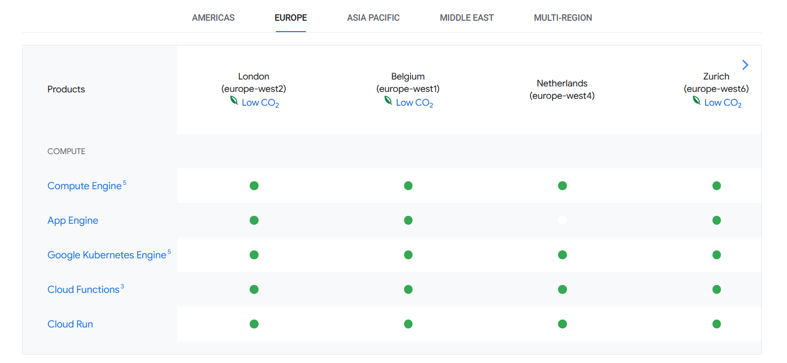
For the complete list of services, and regions, follow the link below.
Useful Information
There is a plethora of information I found during my quest for the greenest regions in the GCP. Some of it is boilerplate, but some of it is rather interesting. Below, I'm going to share the links about the latter.
Google published their 2023 Environmental Report. It's quite an interesting read, and you can find all the numbers in the accompanying PDF. To find out more, follow the link below.
To find out interesting facts about Google's take on sustainability, go to the link below. It's also a starting point to other Google sustainability-relevant sources.
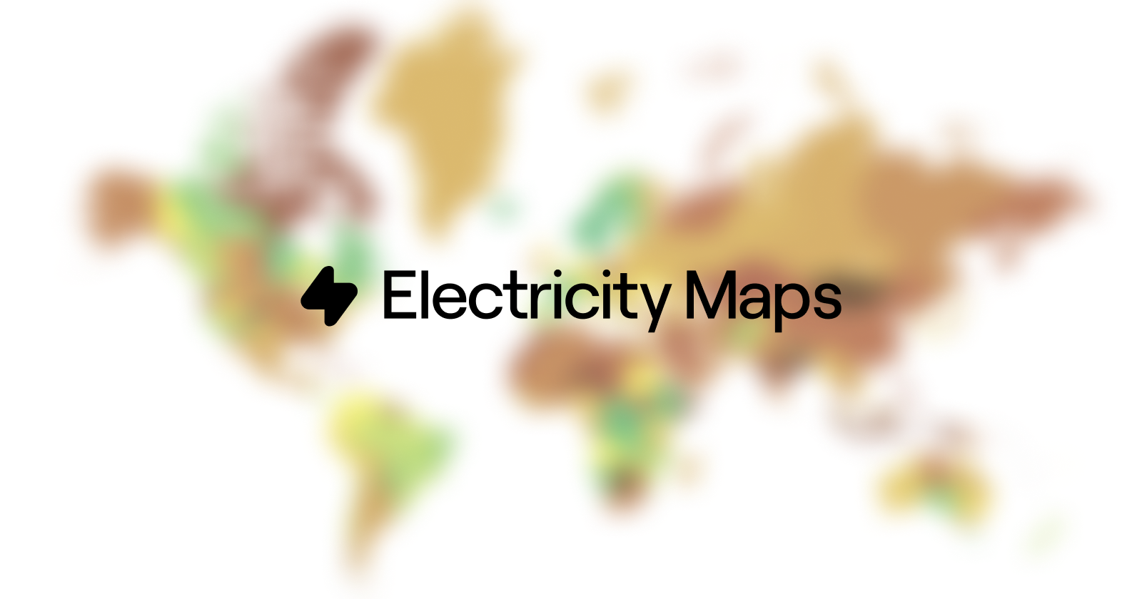
Last, but not least, map showing climate impact by area! This, I found the most interesting. It is a map showing the amount of produced and consumed electricity. And, it's open source! Below is a preview of it.
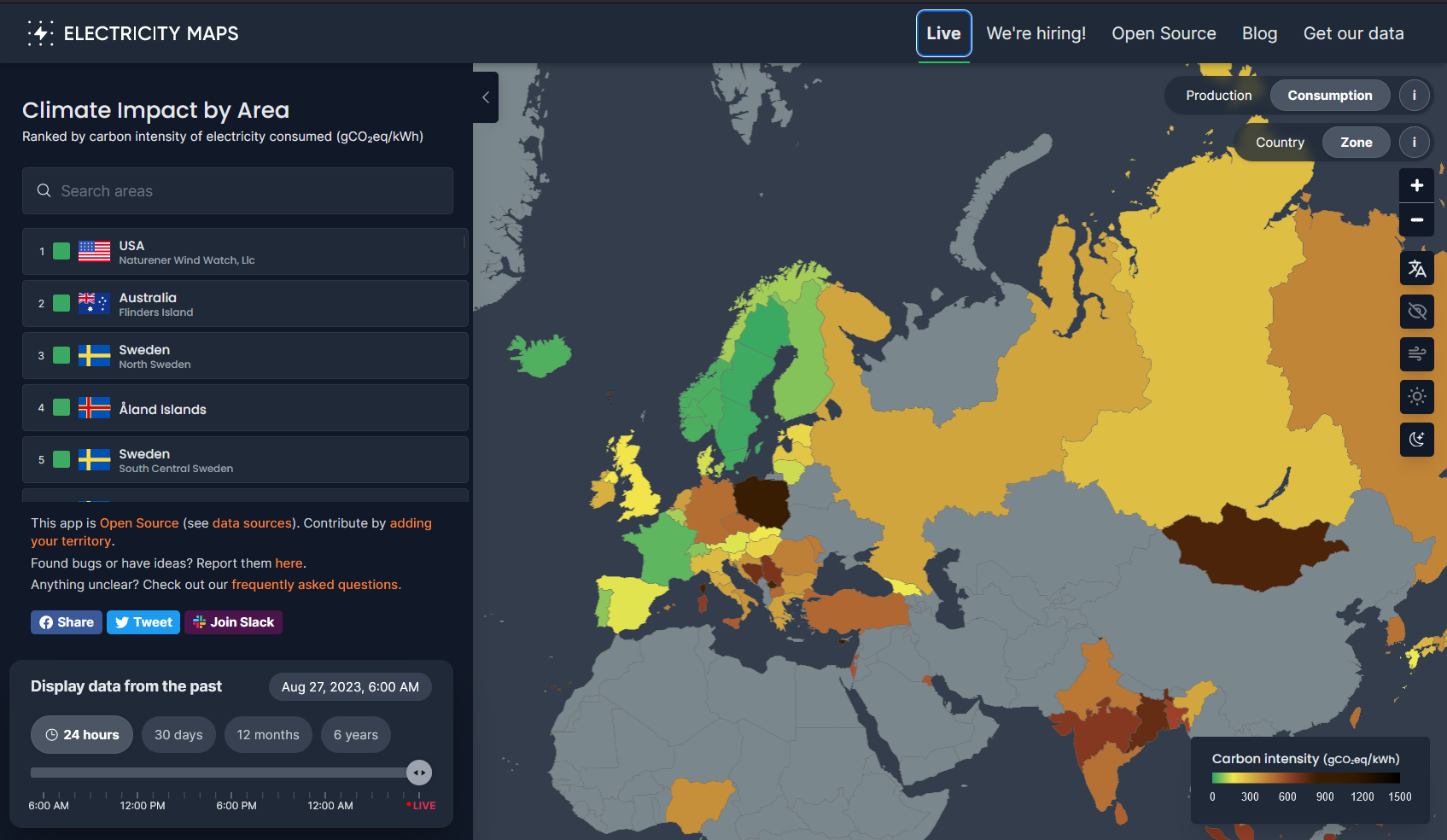
To find out more, and explore by yourself, check out the link below.
Key Takeaways
Google publishes the data in an open manner, and it's quite easy to find what the regions are the greenest. If that is what you are looking for. I like that part. I also like their strive to be carbon-free 24/7 by 2030. Following, are some of the key takeaways from this article:
- Power Usage Effectiveness - how energy efficient are data centres.
- PUE isn't directly related to the region being green, but the less energy we use, the better.
- Google CFE% a percentage of carbon-free energy used in a region, calculated by Google.
When deciding where to host your application, regardless of the provider, consider the following:
- Latency to end users can be different from region to region.
- Prices differ from region to region.
- Some regions can have higher carbon-intensity than others, choose them wisely.
This is it! I hope you found the information above interesting and useful. In the following weeks, I'll wrap everything up in a short(er) summary. I will go through and compare the information from the major cloud providers I covered here.
My plan is to continue to publish sustainability-related articles. To learn and raise awareness. Stay tuned and see you in the next article!