What are the greenest regions in Azure?
What are emission scopes and what do they mean? What methods are used to calculate those emissions? Which methods Microsoft uses to calculate them? What regions are the greenest one on Azure? These and more questions we answer in this article!
A couple of weeks ago, I published an article about the greenest regions in AWS. Check it out if you haven't! Today, I'm going to write about the greenest regions on Azure. Like the previous one, the questions I'm going to cover in this article are as follows.
First, we'll have a look at the emission scopes and their importance. Then we'll talk about methods used in calculating emissions on Azure (and AWS for that matter). Last but not least, we'll see the greenest regions in Azure and available reports.
What are emission scopes?
There is something called the Greenhouse Gas protocol. This protocol is the most used standard companies use to publish emissions of Carbon. It divides the emissions into 3 scopes.
- Scope 1 - Direct emissions from operations owned or controlled by the organization. For example, on-site fuel combustion or fleet vehicles.
- Scope 2 - Indirect emissions related to emission generation of purchased energy. For example, heat and electricity.
- Scope 3 - Other indirect emissions from all the other activities companies engage in. For example, emissions from an organization's supply chain. Business travel for employees. The electricity customers may consume when using your product. And so on.
The one that is the most significant and the most difficult to calculate is, you guessed it - scope 3. It is often referred to as value chain emissions. It represents a full range of activities needed to create a product or a service. From the initial idea to the end distribution.
For example, every raw material used in the production of your laptop emits carbon. Emission resulting from material extraction and processing is part of Scope 3. This scope also includes emissions from the use of the laptop after you buy it.
You can find more information about emission scopes on the link below.

Azure publishes scope 3 emissions, unlike AWS. It (AWS) includes only Scope 2 emissions. This is the reason why I saw 0 emissions on Customer Carbon Footprint Tool on AWS.
Is this what they call greenwashing? #askingforafriend
Methods to calculate emissions
It is a complex process. Adding to that complexity, we need to take into account two methods per GHG Protocol scope 2 reporting guidance. These two methods are:
- Location-based method. Emission intensity of the power grids from which companies consume electricity. The energy you use.
- Market-based method. Reflects emissions from the electricity that companies have bought. The energy you pay.
Both these methods are ways of calculating carbon emissions from Scope 2. Now, the report above recommends using both of them in calculating emissions. This is dual reporting. According to the reports, AWS only uses a market-based calculation method. Azure (Microsoft) uses both location-based and market-based methods.
To be honest, I don't quite understand the need for a market-based method. Other than the following.
We bought electricity from renewable sources, thus our emissions are 0. We don't care from which sources we actually get it.
To me, the more logical solution is location-based, or a combo of these two.
What are the greenest regions in Azure?
Now to the exact numbers. For starters, Azure wasn't as straightforward as AWS. You need to dig deep to see what percent of renewables power their regions. Or, I wasn't able to find that out as I did for the AWS.
Microsoft pledges to shift to 100 percent renewable energy supply by 2025. That probably means they are close to it, so let's check.
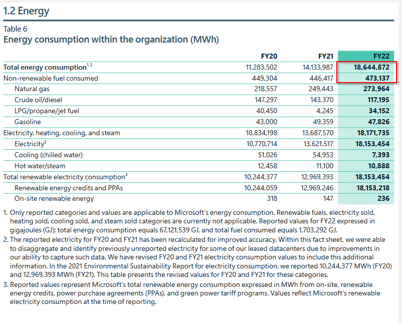
The table above is from the 2022 Environment Sustainability Report - Data Fact Sheet.
To calculate the percent of renewable energy used, we will use the above marked numbers. If we divide the two, and multiply by 100, we can see that ~2.5% of consumed energy comes from non-renewables. That means that the other 97.5% are from renewables. Which is great! That is, if the values they are reporting are correct.
Continuing on my quest to find the greenest regions, I found this.
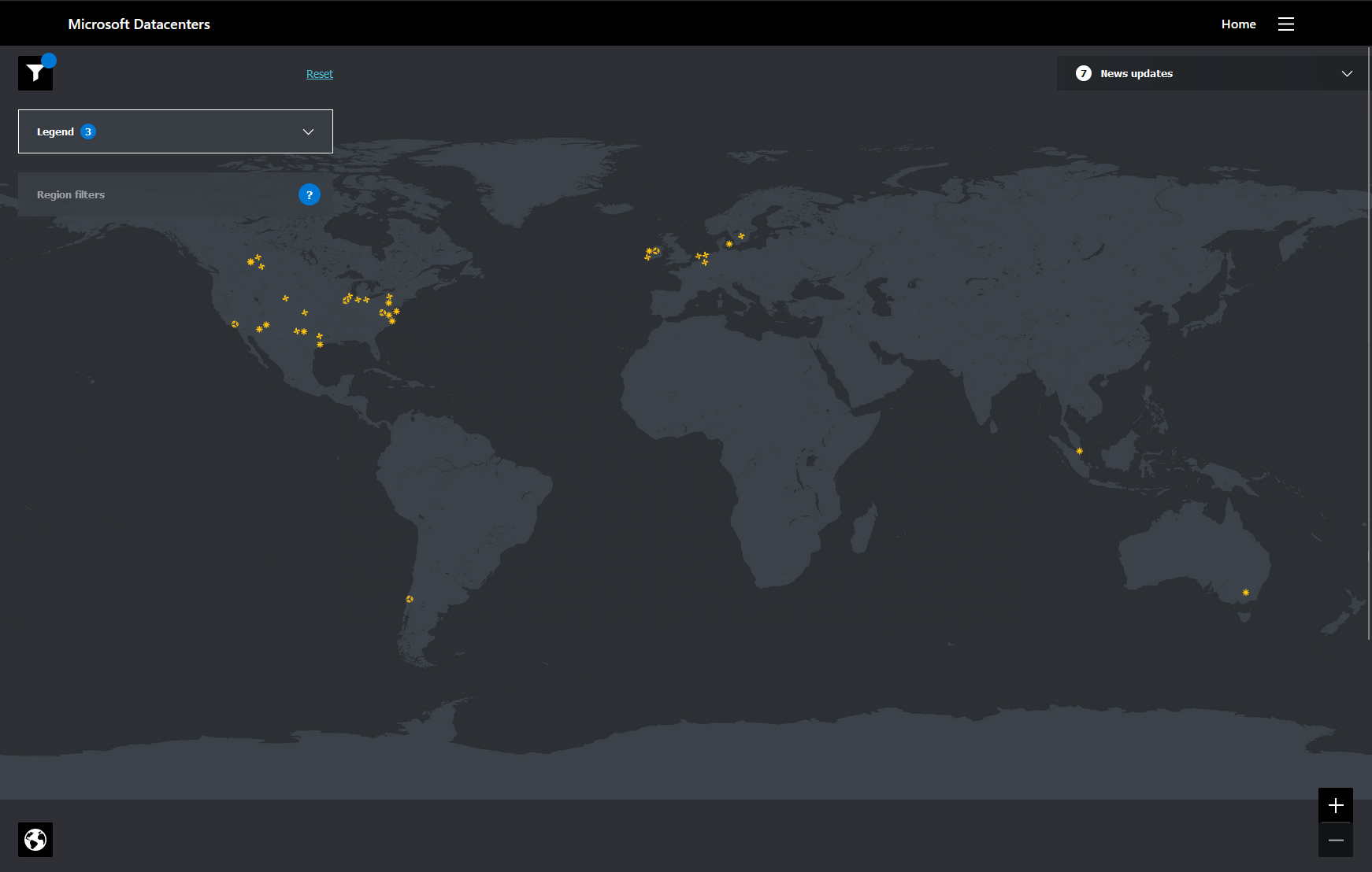
This screenshot shows the location of Microsoft's sustainability projects. They spread all over the US, Northern Europe, and a couple of those projects in the rest of the world. Then I went and applied some extra filters, shown in the image below.
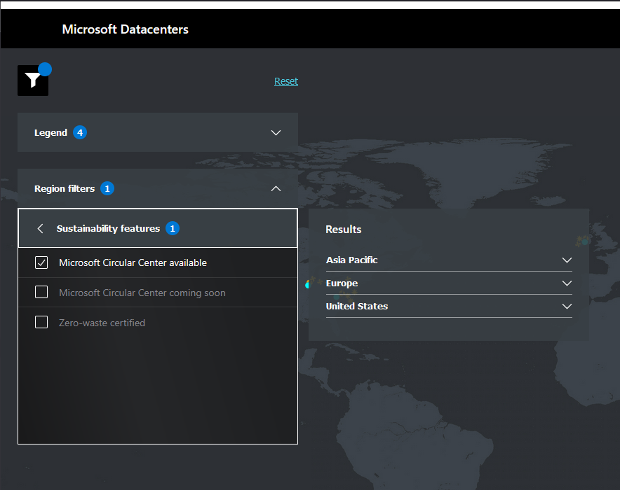
I selected the Microsoft Circular Center sustainability feature. To translate this - the equipment from those data centres is going to be re-used when they reach the end of life. Or EOL, as one might call it. On the video below, you can find more about this feature.

Selecting this feature produced an output below. Blue dots are regions, and yellow symbols are sustainable projects.
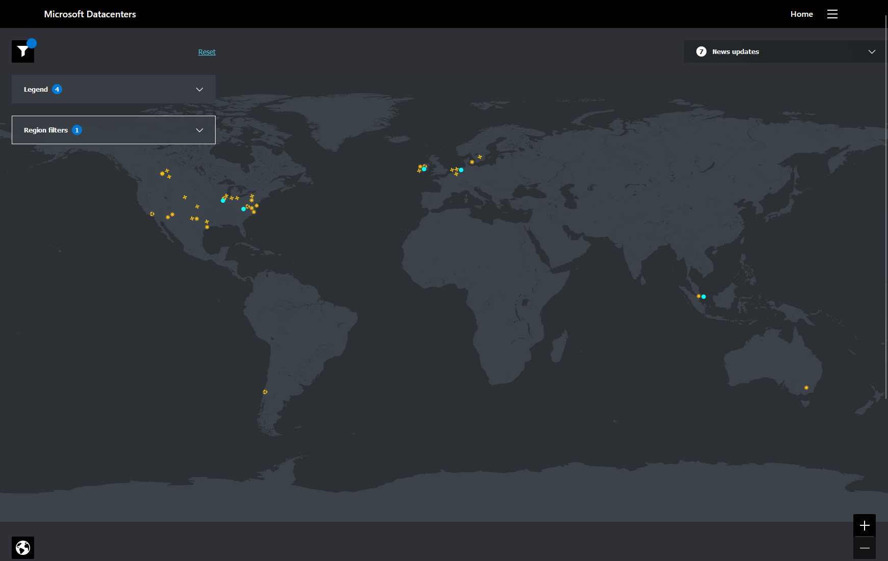
This leads me to assume that the greenest regions on Azure are:
- North Central US
- East US 2
- North Europe
- West Europe
- Southeast Asia
If you want to check this out on your own, go ahead and visit the below web page.
The above is my assumption. And knowing that I'm not a fan of assumptions, I tried to find a bit more. And I found the below quote.
We’ve also built one of our most sustainable cloud regions in Sweden that launched in November 2021. This will enable us to use 100 percent renewable energy for each hour of consumption. Sweden will be the first Microsoft region to use lower-carbon renewable fuel for backup power. source
Finally! We have a winner - it's the region in Sweden!
The following link leads you to the 2022 Environmental Sustainability Report. There you can see everything described in more detail.
How to calculate your emissions?
There is a tool for that on Azure, and it's called - Emissions Impact Dashboard. It is a Power BI template that helps you calculate the emissions of your workloads running on Azure.
There is a catch, however. This tool is only available for Power BI Pro users, so if you are one of them, congrats! If not, I guess a demo would be nice to have a look at and play around. Like it did for me. And at least this one doesn't show 0 MTCO2e emissions.
To find out how to use and configure the tool, check out the link below.
Since I don't have any workloads running on Azure, I haven't had a chance to check out this tool on proper terms. Have you had a chance to do so? What are your findings, learnings, and experience from using it? You can write your impressions in the comments below.
Key Takeaways
Researching for this article took me down the rabbit hole. I doubted if I will be able to find the exact numbers. I still doubt I found them. On the other hand, it helped me understand things. I saw how big sustainability is for Microsoft. And that gives me hope.
Below are some of the key takeaways throughout my journey in writing this article.
- There are 3 scopes of emissions. Direct, indirect via power consumption, and indirect emissions from all other activities.
- When looking at the reported emissions, we need to have in mind the methods used in calculating them. Those methods are: market-based, location-based, or both.
- Emissions calculated only by market-based method could lead in the wrong direction. For example, emission numbers are smaller than it actually is.
- I got the impression that Microsoft cares about sustainability and the way they report it. They are also the ones behind the Green Software Foundation. Kudos! Even though information is a bit harder to find, it seemed more concrete to me when I did the research.
- You can use Emission Impact Dashboard to calculate emissions of Azure workloads.
To go down the rabbit hole yourself, visit the below page.

See you in the next article!